
essential styling tips from your friendly neighborhood Austin family photographer.
- Jun 28, 2023
- 5 min read
Updated: Jul 5, 2023
We've all been there... you just booked a family session with your favorite local photographer, she just gave you some amazing locations to choose from, and you've just spent an hour on pinterest, endlessly pinning a million and one outfit ideas onto a board but still have no clue what the hell to put everyone in or even how to start piecing it all together. You start digging through your closet and before you know it, 30 minutes has gone by and you've somehow managed to pull your entire wardrobe out onto the floor in search of the perfect outfit. it's either the pink floral dress you bought five years ago for a friend's baby shower that just doesn't fit right, or the amazon dress that you bought because it was trendy 2 years ago and you never found the right time to wear.
God forbid even thinking about what the hell to put your husband or the kids in!
Well have no fear, your friendly neighborhood photographer/fashionista is here!!
First and foremost, let's talk about color scheming.

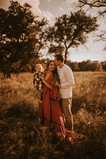
Aim for neutrals, earthy tones, and metallics. These colors compliment the outdoor environment almost anywhere you go and look damn fine as a framed photograph in your home. Don’t get me wrong, I’m not all for a beige world of quiet and boring colors. By neutrals, I just mean softer tones.

Primary colors are incredibly striking but can sometimes have the effect of being overpowering and distracts from the face, emotions and from the main subject (which should be you) Most bright and bold colors interact poorly with skin tones and often reflect the color onto your skin. So, for example, instead of electric blue, go for something closer to sky blue, or even navy. Instead of bright green, aim for a sage or deep olive green.
A path to take is to choose to either complement your environment or contrast it. A maroon dress in a deep green forest will look epic, whereas a bright pink, patterned dress doesn’t really fit in with the foresty vibe.
For families it’s best to keep your color palette limited to four colors. You can choose one person to wear a feature color and have everyone else’s outfits complement that.
complementary colors
These colors, the ones that look incredible together, are called complementary colors. They complement each other and are pleasing to the eye.
They’re salt and pepper, Bonnie and Clyde, peanut butter and jelly.
Complementary colors sit across from one another on the color wheel (i.e. blue and orange, red and green)
below is an example to show us how complementary colors do special things for the big picture.

When you're looking at options for your wardrobe, it's best to pick a color that you know you look and feel good in.
analogous colors
But it’s not all about contrast. We’re all built so different and we each respond to color combinations differently. For those less taken by the ‘pop', analogous colors could be the way to go. Analogous colors are next to each other on the color wheel and can be quite soothing to the eye. Think of the jungle and all of the lush variations of green, or the ocean and the infinite hues of blue.
below, is an example that illustrates how analogous colors work together beautifully.

complementary good, matchy bad.
You don’t want to create the illusion of being your partner’s Siamese twin. When multiple people wear the same color, sometimes their matching outfits blend together so much that you can’t really see any of them properly. The viewer can’t tell where one person begins and another one ends. They turn into one uniform blob. In order for the aesthetics of your photograph to really sing, you want to find complementary outfits that showcase a variety of colors, textures, accessories, and tones.
Complement the other people in the photograph as well as your surroundings. The idea is to have everything look good together without everything looking the same.
Here's a few examples of some cohesive wardrobes.


be careful with patterns and prints.
Avoid crazy patterns as they often dominate the photograph and distract from your beautiful face "polka dot, paisley, herringbone, or animal print." These are a huge distraction and create awful distortions in digital portraits.
subtle smaller patterns work best. Flannels or a light floral print are great when they complement the location. But less is definitely more with this one, try to limit yourself to one pattern at a time. Matching patterns is a tricky task, and it’s super difficult to do well. You want to pick a subtle pattern for someone in your family, and piece the rest of your family's wardrobe around that.
Below are some examples of how to successfully build off of a pattern.


makeup and hair (do's and don'ts)
do's
look like you. do whatever you need to do to feel confident and beautiful. but remember, less is more.
Treat yourself to a little subtle manicure or make sure your nails are neat and tidy before the shoot. I'll be the first to say that hands tell quite the story BUT you don't want to zoom in and see dirty fingernails. you won't be able to unsee it lol.
when it comes to saving a moment and putting it in your pocket, a wild mane that blows in the breeze is the way to go. With your hair down, you get movement, you get interest, you get some perfect slices of imperfection in the best possible way.
A slight sparkle is good, but don’t overdo it
don'ts
Don't over contour. like stated above, less is more.
Avoid bright eyes and lips. Keep it neutral and flattering.
don't get a haircut right before your shoot. You'll regret it every time.
and for the love of all things holy, brush out those curls!!
dress for the season
I can't tell you how many families I've photographed that were either miserably hot, or miserably cold during their session. So, plan your wardrobe around the season. When you strap on 2-3 layers of clothing and it's sweltering outside.... you're going to see how uncomfortable you are in your photos. In winter...it is a little easier to get away with a light jacket... you can warm up while moving around...
vs summer... the second you move while wearing a sweater in 95-degree weather.... you're sweating!
Accessorize!

Fun hats, textured dusters, bold jewelry and great shoes. Take this opportunity to think outside the box! A cool pair of glasses or your favorite denim jacket is a great way to change up your look between poses! a quick swap of your accessories can make all the difference!

Bringing some florals, champagne, beer, or something fun like a guitar or a cozy blanket is also a plus!

pets can also make a great addition to your shoot! I get all up in my feels when my clients bring their fur babies!
So let's do a little recap shall we!?
Compliment - don’t match (unintentionally)
neutral, earthy tones look amazing in most settings.
avoid bright colors (google color casting)
leave that leopard dress at home girl.
Throw some accessories like a hat or denim jacket into your bag.
If you're still stumped, ask for help! I am willing to bet that you're photographer would love to help you with your wardrobe. I get so excited every single time i get the "what do we wear" email!


Comments